
Every data point is collected and securely stored within the Cellma network. This includes data such as patient records, admission, referrals, discharges, diagnoses, prescriptions, drug usage and wastage, financials, and geographic data. The dashboards use the data and convert it into graphs, maps, and charts to show changes over periods of time, within a given period, or in averages. They give a uniquely higher-level view but are also fully interactive for more specific data drill downs.
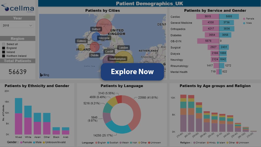
A one-page overview of data from multiple clinics or hospital locations. Drill down to specific locations or investigate particular demographic groups with just one click of a button. An effective and powerful tool that can be customized to your clinics or hospitals – a great resource for higher-level organizational leaders and clinicians alike.
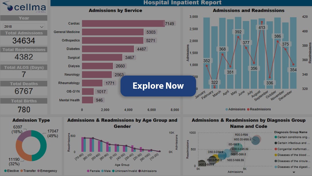
The longer the stay of a patient, the more money and resource has to be allocated to that individual. However, it is important to ensure people have as long as they need in the hospital as readmission can cost even more. It’s a difficult balance. The dashboard allows you to explore your inpatient flow and gain an understanding of what areas can be improved to reduce the readmission rate.
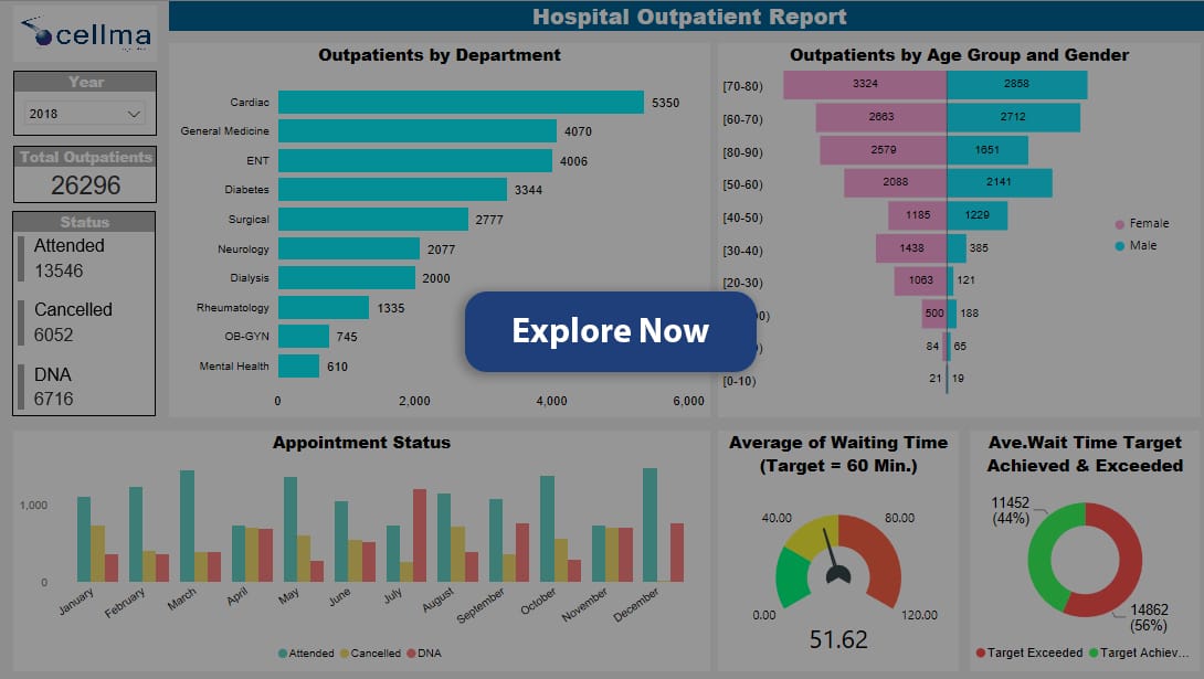
Key to improving outpatient experience is understanding who they are, what care they require, and how long they waited to see a professional. The outpatient dashboards show you all of this and more. Use the drill-down tools to see specific outpatient groups’ activities – such as cancellations and no-shows. This dashboard offers a tool not only to change the outpatient experience but to also meet goals and keep them on track.
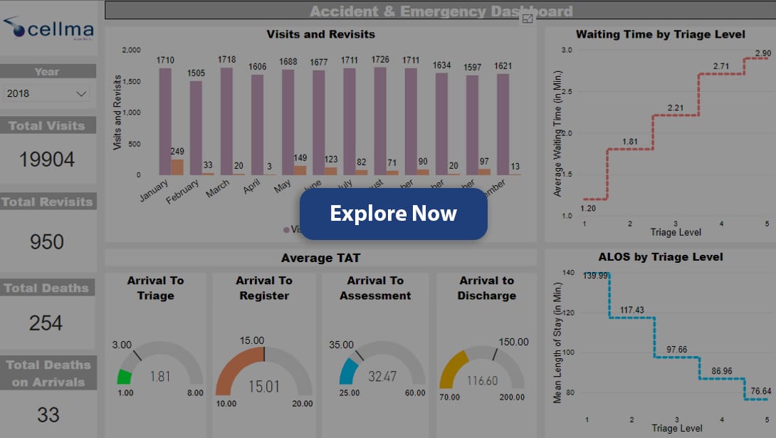
A&E is a busy and at times chaotic place, but one which has to meet targets and run as efficiently as possible just like any other section of a hospital. Keeping abreast of all patient admissions, and demographic data and tracking waiting times is difficult enough, without having to process it into usable graphs and charts. The A&E
dashboard does just that – giving you clear and concise graphs and charts which allow you to compare and contrast your data to increase efficiency across the A&E department.
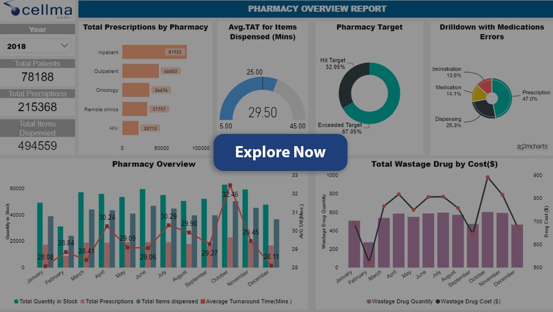
Running an effective pharmacy, either within a hospital or independently, takes skill and organization. All data gathered in a pharmacy can provide vital insight into how to reduce stock wastage, drug trends, and medication errors. With this information mapped out on the pharmacy dashboard, it’s never been easier to get a full understanding of the end-to-end process and effectively implement changes to better your pharmacy.
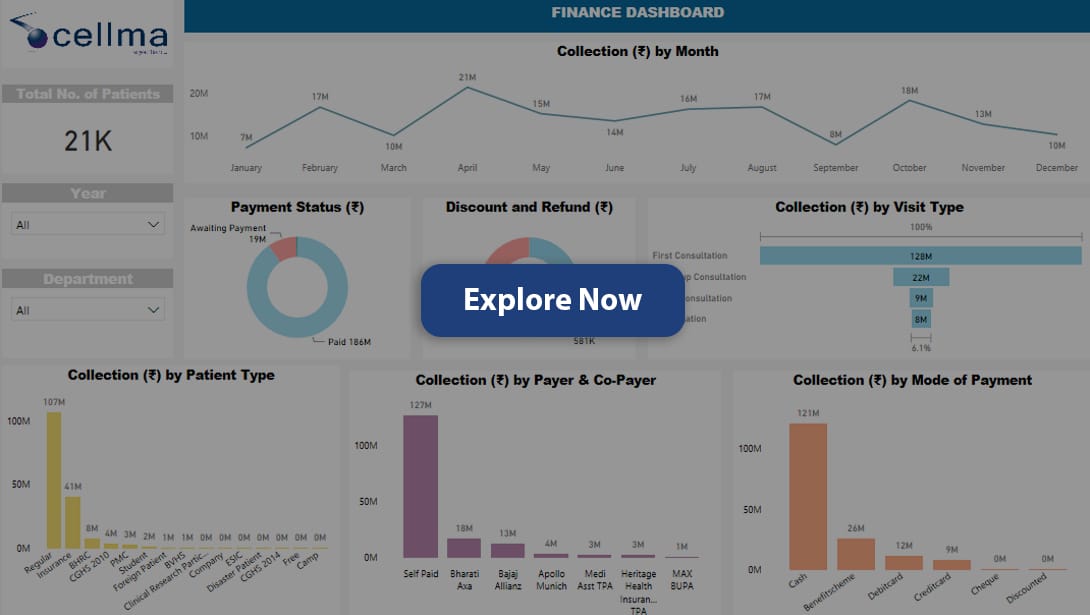
Having a clear oversight of your numbers, figures, and targets is essential to good financial health. But, when working with such big budgets and an ever-changing set of statistics, it can be difficult to keep on top of the key performance indicators that really matter. Using the financial dashboard, you can track and compare all incomings, outgoings, returns on equity, assets, and several other data points. Together they give a full picture of your financial standing, ensuring your targets are not only met but exceeded.